The Problem: What's the challenge?
GalleryPal wants to create a mobile application that improves the user's in-person museum or gallery experience when looking at artwork
Problem Scope
How might we create an immersive experience for users when exploring the museum?
The Solution: Creating a personalized tour experience
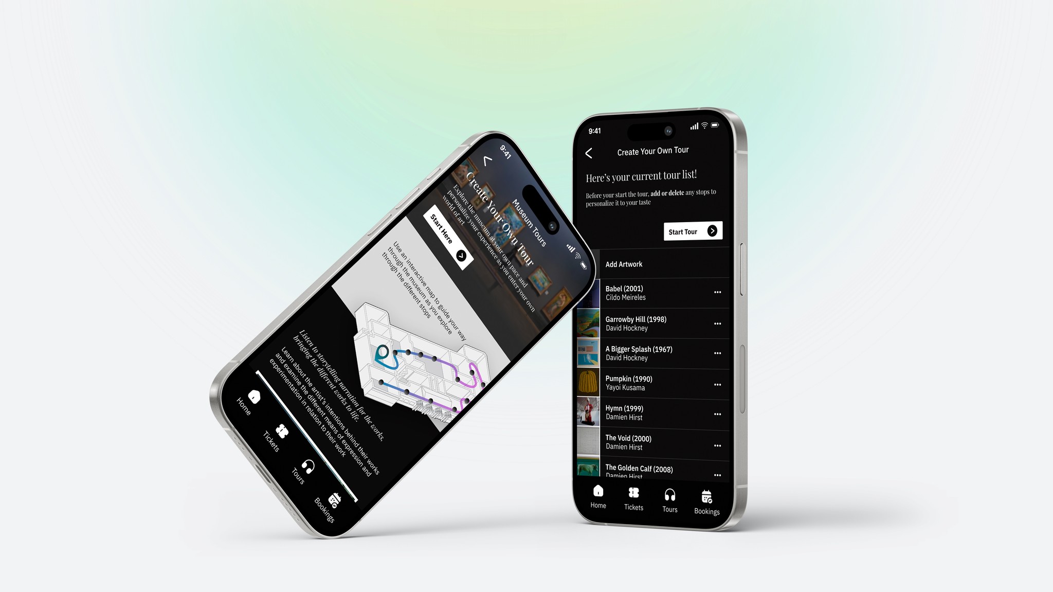
The design sprint challenge aimed to improve a user’s experience when visiting a museum, and incorporating technology into the in-person experience. The Museum App focused on the ‘tour’ experience for the user, mixing both aspects of guided tours and audio tours to create their own personalized tour.
To streamline the process of creating a tour and prevent users from spending excessive time selecting each component individually, personalized tours have been organized into various themes. Users can then easily customize these themed tours to their preferences.

Day 01
Map
Identifying User Needs
Mapping Out Potential User Journeys
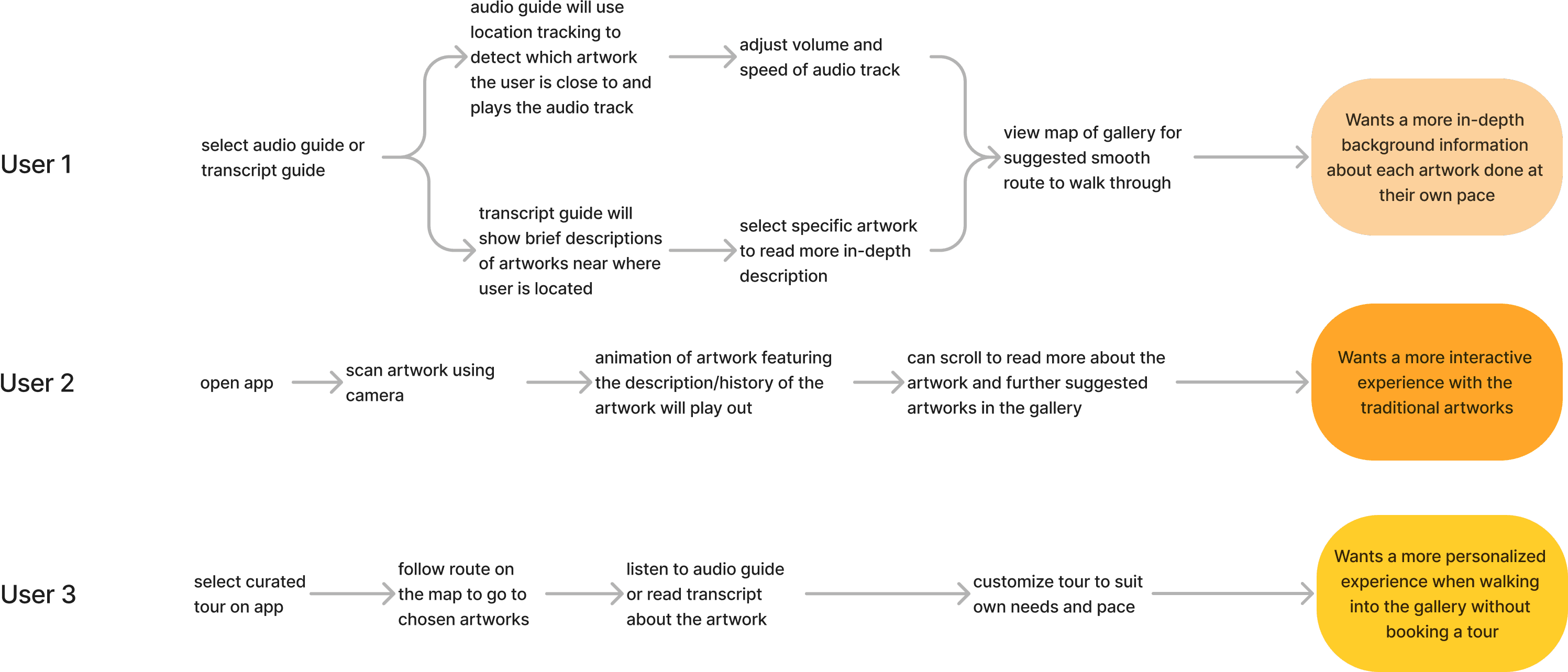
Three user journeys with different end goals were mapped out to understand what process was needed for the GalleryPal app to reach the end-state. While each user journey varied slightly, they all shared the end objective of enhancing the app's capacity to deliver comprehensive information about artworks to users.
Day 02
Sketch
Research Existing Museum Apps
In order to have more ideas on how to design an app for a museum, I searched apps that were currently used by different museums that were targeted for visitors that were there in-person. The goals at this stage were to have a foundational understanding of what features users may see when navigating through the museum app, and what features would stand out from the apps to enhance the user's experience
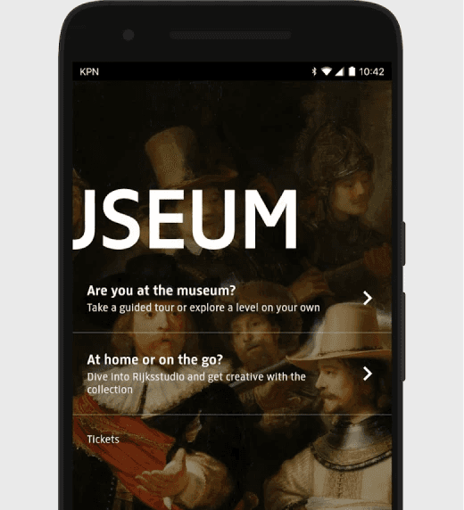
Rijksmuseum
The Rijksmusuem app is personalized for the user to allow them to create their own guided tour in the museum by selecting specific artworks
Features that stood out:
The app is multimedia, it contains animation and audio guides
There is a clear floor plan of the different levels and a drawn out route to guide the users
British Museum
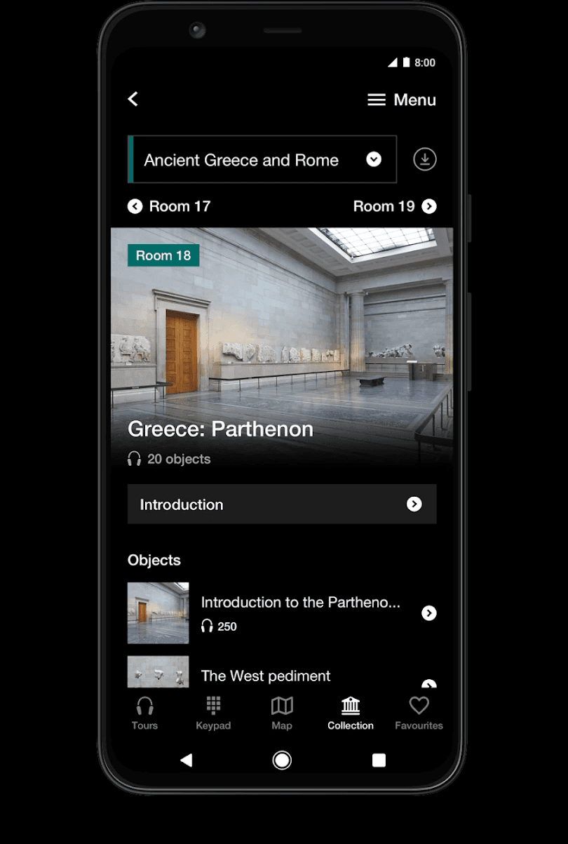
The British Museum app is also targeted for visitors that were visiting the museum. They can use the app to listen to guided tours and have audio/text/video/image explanations to introduce the artworks
Features that stood out:
There is a keypad option for users that didn't want to listen to a guided tour but can input the digits under the specific artwork to hear more about it
Clear organization of audio guides based on their themes and location
Users can download the tours in advanced incase of bad cellular data at the museum
Smartify: Arts and Culture
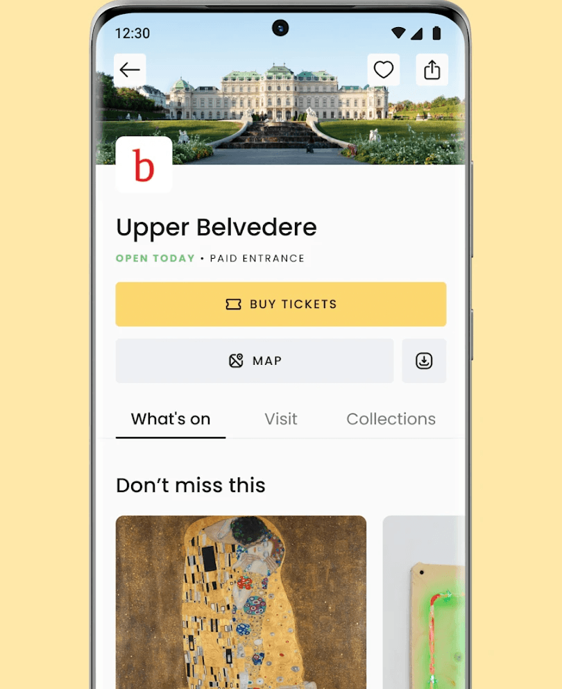
Smartify is a cultural travel app that includes artworks from different museums and art galleries. Users can book tickets for different museums and learn more about the artwork through the app
Features that stood out:
Suggests different artworks based on what the user has saved
Audio tours, guides and videos available for users that are at the museum in-person
Not limited to visitors, users that are not located within the museum can still use the app to learn about different artwork
Sketching Ideas
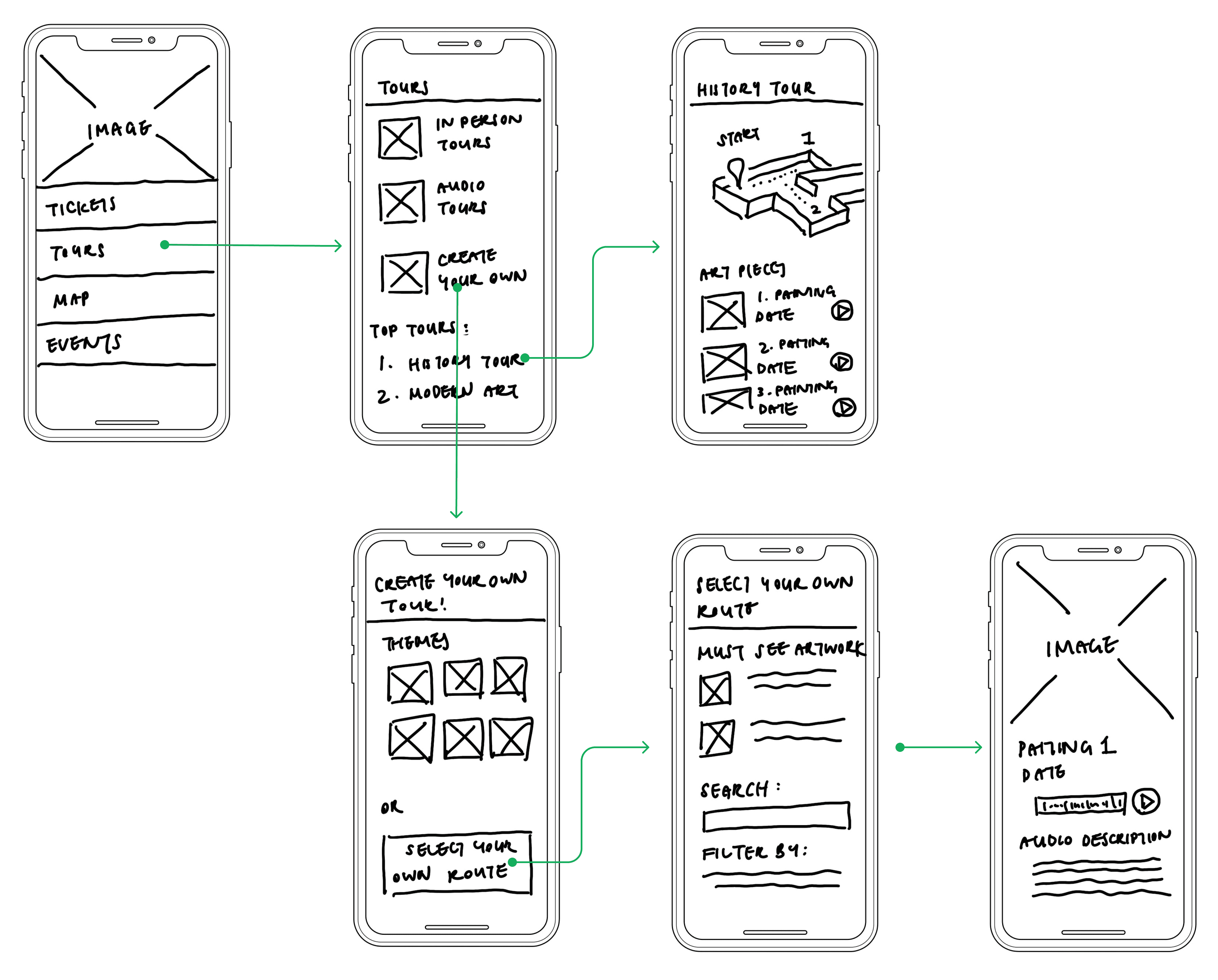
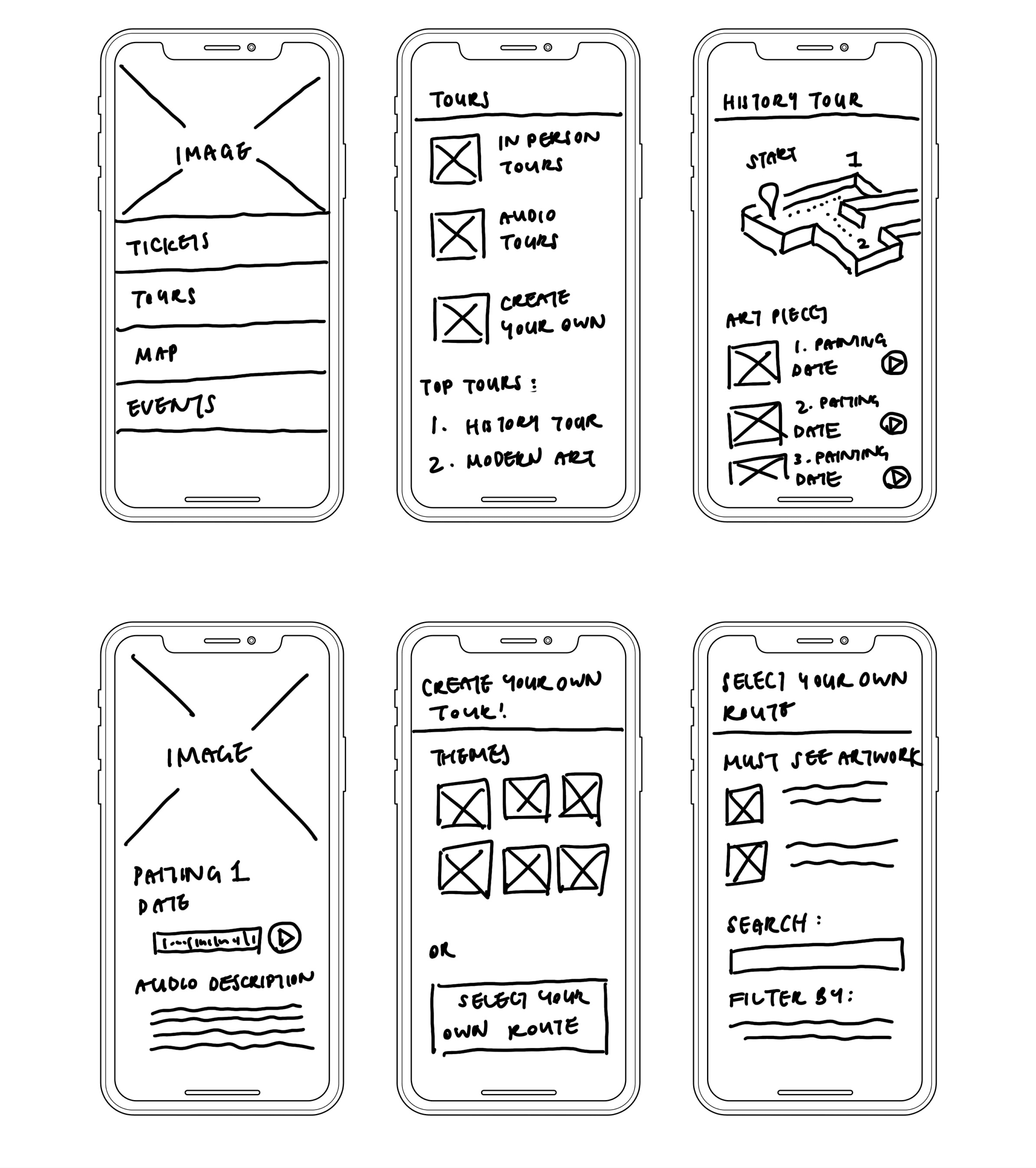
Based on the user journeys that were mapped out and research of similar apps, I sketched out some screens of what the app might look like. At this stage, it is still a very quick brainstorm but it lets me have a vague idea of how to refine the screens and what the storyboard may look like
Day 03
Decide
Creating a Storyboard Flow
Using the sketches, I created a storyboard flow of how a user might interact with the app. This allows me to know whether there are additional screens that needs to be created when creating the high-fidelity screens, or if there are any features that needs to be adjusted to make sure users can complete the entire flow.
Day 04
Prototype
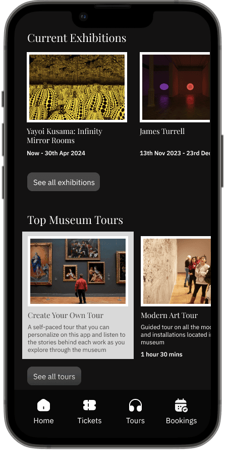
1/ Information on current exhibits and themed tours for visitors
Visitors can engage with the artworks by using the app to learn about the current exhibitions within the museum and join the different themed tours available
/Museum highlights in a glance
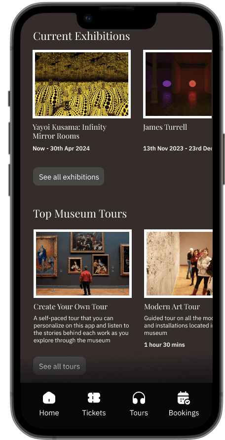
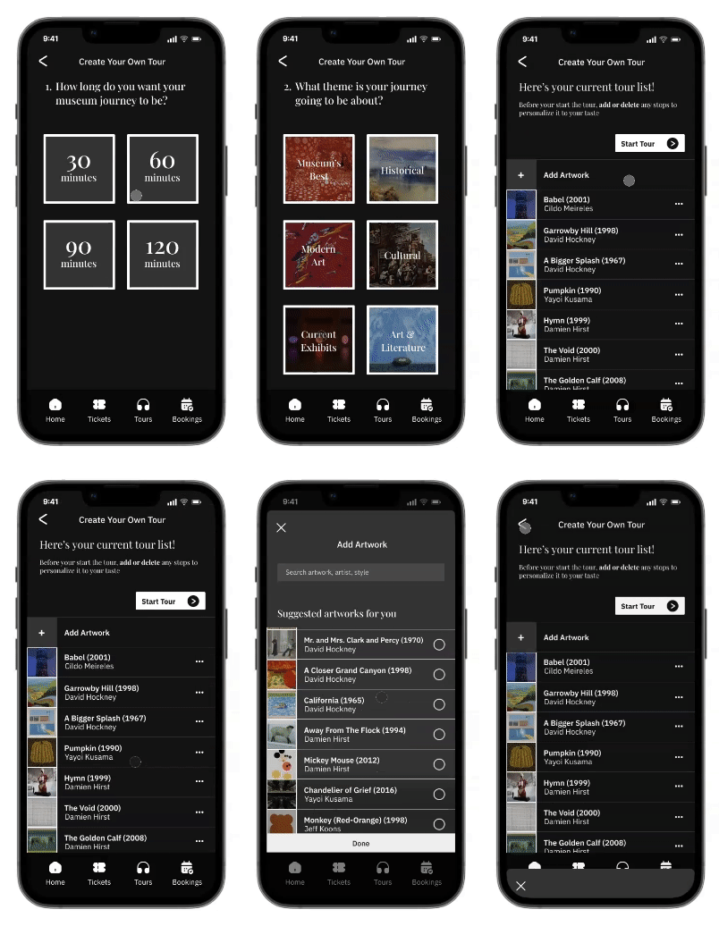
The homepage is designed to provide users with instant insights into the museum's current offerings upon opening the app. Users can seamlessly navigate to specific tours tailored to their interests with just a few taps

2/ Guided tours at their own pace
One of the main features of the app allows visitors to create their own guided tour where they can personalize it to their own time available and interests. Visitors also have the flexibility to add or delete any artworks from the tour list to their own liking
/Themed tours
The introduction of various themes during the process aids visitors in swiftly curating artworks based on their interests. This streamlined approach reduces the necessity to sift through numerous artworks individually, while still allowing them to have the flexibility of personalizing it after
3/ Audio and text description available for the artworks
Each artwork is accompanied by concise yet informative descriptions, providing visitors with a deeper understanding of the artist's intentions and the background of each piece. These descriptions aim to enhance the viewing experience by offering context and insight while ensuring that visitors are not overwhelmed with excessive information

Day 05
Testing
👍🏻 The good things!
Users liked the general design of the app
Good feedback on the flow and easiness of creating their own tour
Users thought the experience was informative and would improve their experience when visiting the museum
📝 To work on
Users thought the ‘create your own tour’ wasn’t prominent enough on the home screen
People didn’t know the map could be interacted and moved
People wanted to explore other features that were written on the app but not developed
Testing people's engagement
Additional Issue
Another issue that I found unrelated to the user testing was that my computer screen had the wrong color balance, which I only fixed and found out after the user testing. The screen shot on the right is with the wrong color balance, where the some colors that were meant to be white turned grey. The background was also a dark brown instead of a dark grey that I intended the design to look like
Reflections: What was learnt
🧠 Designing for a personalized experience is a challenge
It proved to be a challenge to balance between giving enough options to users for personalizing their tour, but also limit the variations so users won't be spending excessive time setting up their own tour
🤷♀️ Museum tours might not be everyone's cup of tea
Testing showed that although the majority of users found the concept interesting, some didn’t find it intriguing enough to use every time they are at the museum
⏱️ What I would do if I had more time…
As it was a 5 day design sprint challenge, I didn't have enough time to improve on the current design based on the feedback, but in the ideal situation the valuable feedback would be implemented in future iterations. Animations and story-telling audios would be added to the tours to give more depth to the story-telling behind the audio guides and create an overall more immersive experience for the users when using the app
Figma Prototype
Click here to access the Figma prototype, or interact with the prototype below
