Case Study

Spendsy Revamp & Redesign

Increased business and customer engagement by redesigning the coupon generation user flow for Spendsy— a new digital wallet startup company

Details

Year

2024

Team

2 UI/UX Designers

2 Stakeholders/ Developers

Type

Digital Wallet Startup Company

Brief

Spendsy is a startup company that provides B2C services in coupon creations for customers to use when visiting businesses

Spendsy Revamp & Redesign

Increased business and customer engagement by redesigning the coupon generation user flow for Spendsy— a new digital wallet startup company

Year

2024

Role

Product Designer

Team

(2) Product Designers

(3) Stakeholders/ Developers

Type

Digital Wallet Startup Company

Brief

Spendsy is a startup company that provides B2C services in coupon creations for customers to use when visiting businesses

Overview + Business Goals

Overview


Spendsy is currently in the rebranding phase where they are planning to relaunch the app with new features while updating current features and update the design of the app to attract a wider range of audience.

Spendsy's business goals:


  1. Encourage businesses to use their own images: One of the primary issues was that businesses weren't utilizing their own images to showcase their products, instead relying on default images. This resulted in the explore page of the app being populated mainly with default images, which made it challenging to attract customers.


  2. Higher completion and retention rate: While creating coupons is a key feature in the app for businesses, the user journey to generate a coupon lacks a clear flow. The presence of numerous advanced features often distracts businesses from easily completing the coupon creation process.


The Impact
96 % of users says their experience with the app has improved
User Satisfaction


After implementing the new design features into the app, the feedback from the users (both businesses and customers) were positive


Higher Retention Rate


Higher engagement observed from customers using the app to explore for different coupons after making businesses use their own images to promote their coupons


Let's take a look at the process…
So how was the problem addressed?

To address these challenges and create an innovative coupon app, Spendsy took the following approach:


Changing the user flow for generating a coupon for businesses: The user flow for generating a coupon for businesses was complicated and directed businesses with use the default cover photos that were provided from the app instead of probing them to select their own images

User Flow Before:

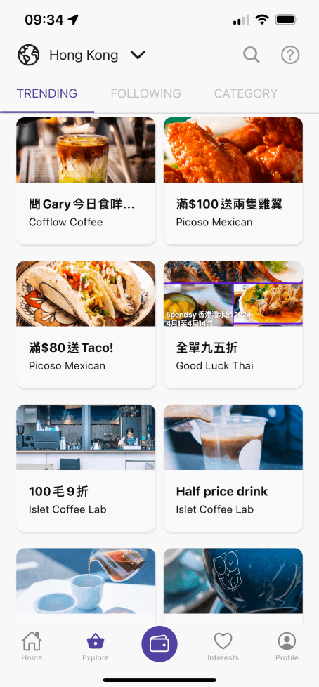
How does the current flow affect potential customers?
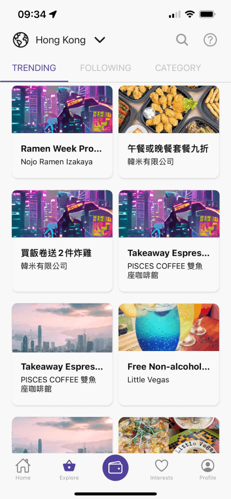
Current explore page populated with default images = lower customer engagement


Businesses weren't utilizing their own images to showcase their products, and instead were choosing the default images that were offered to them. This lead to a lower retention rate from potential customers as they were less engaged in exploring the different coupons that were offered on the explore page

How might we let businesses create coupons easily while also attracting customers to use the platform to utilize the coupons?
What do we want to improve on?
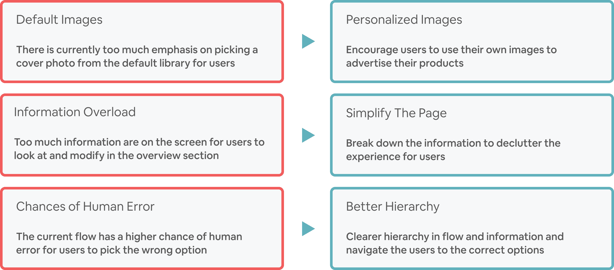
Problems
Goals
Crafting the right flow
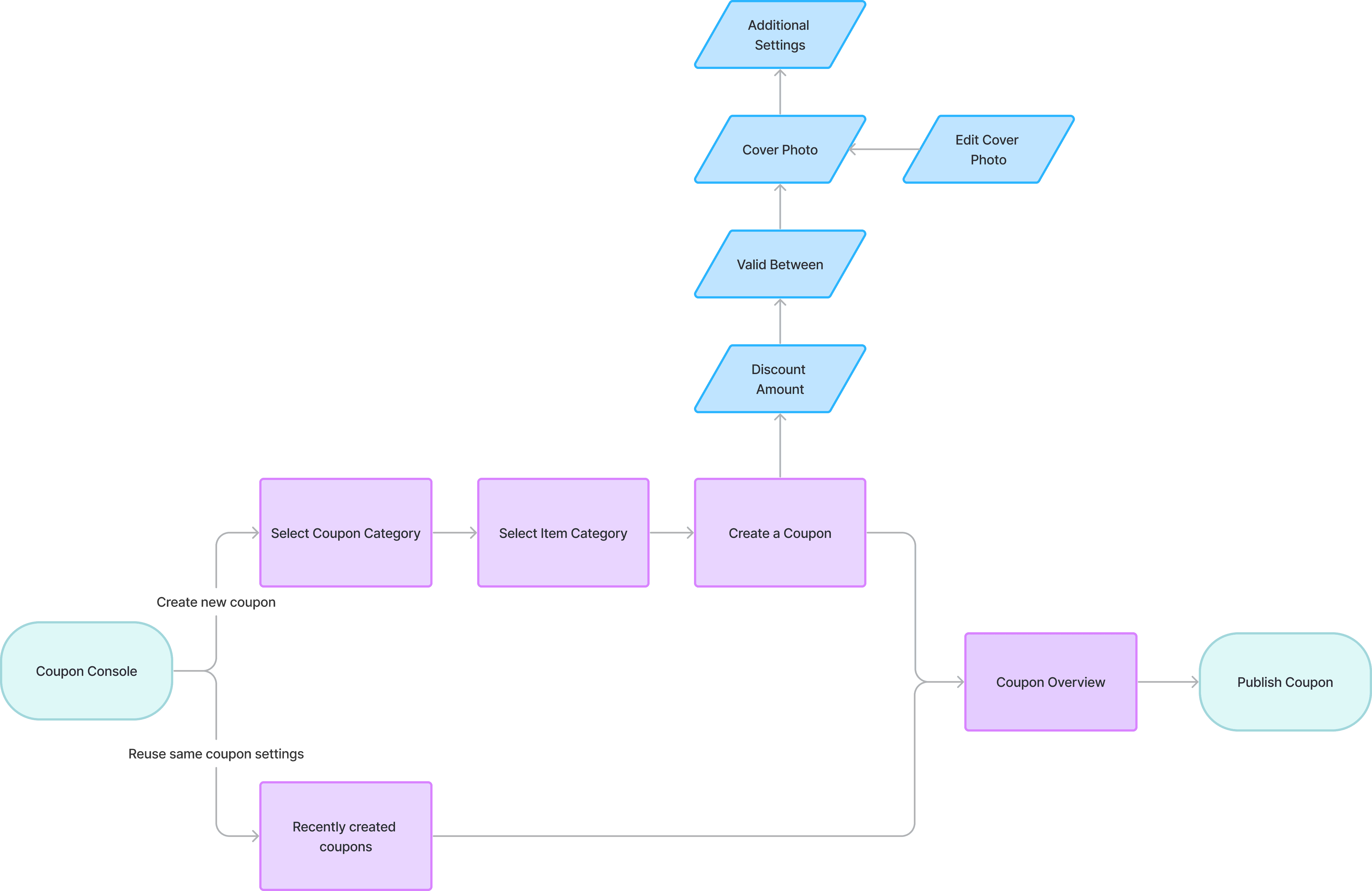
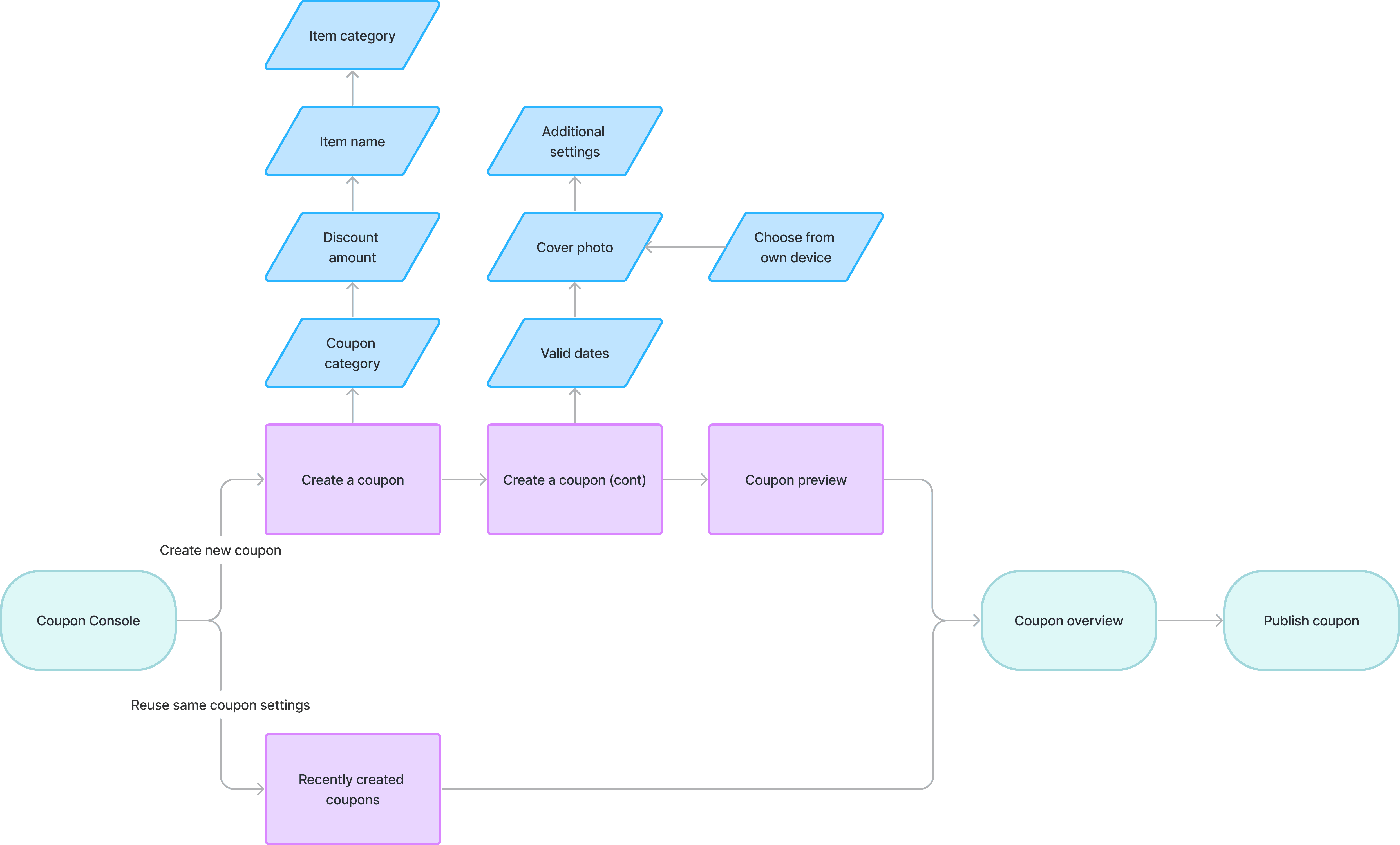
Two different user flows were planned out to see which one would shorten the current user flow and make it easier for users to generate a coupon

Two different user flows were planned out to see which one would optimize the current user journey and make it easier for users to generate a coupon

Option A

Option A

Key Takeaways


  • After discussing with the team on the two user flows, Option B was the preferred option to be further developed as it breaks down the flow to more screens, making the inputs for each screen seem less tedious and crammed for the user to go through


  • To avoid human error when picking coupon type and item category, we wanted to ensure the options were clearer and easier to comprehend


  • Discussion with front-end developers when developing high-fidelity designs: which picture ratio to use for images and whether they should be kept consistent with other features in the app


Option B

How can we improve the process of generating a coupon?
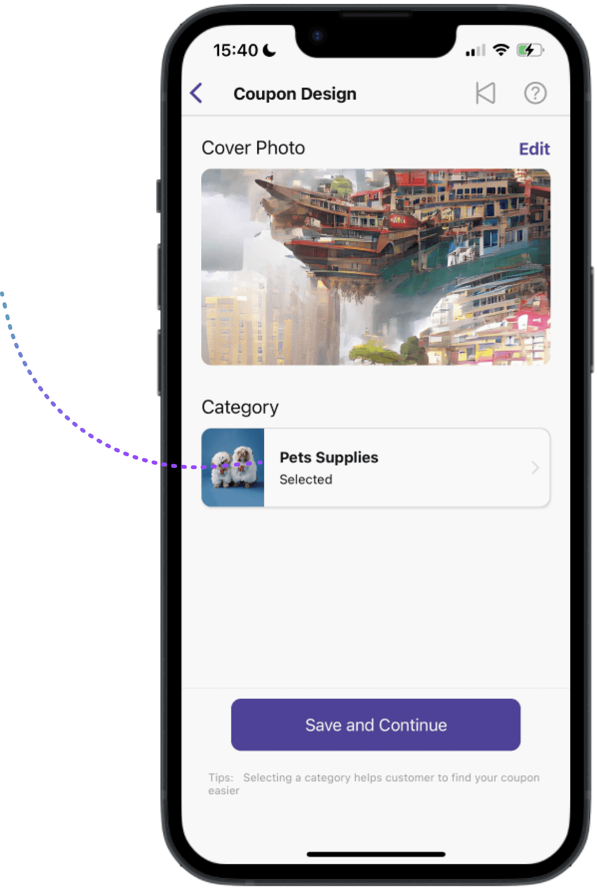
Personalized cover photos from businesses

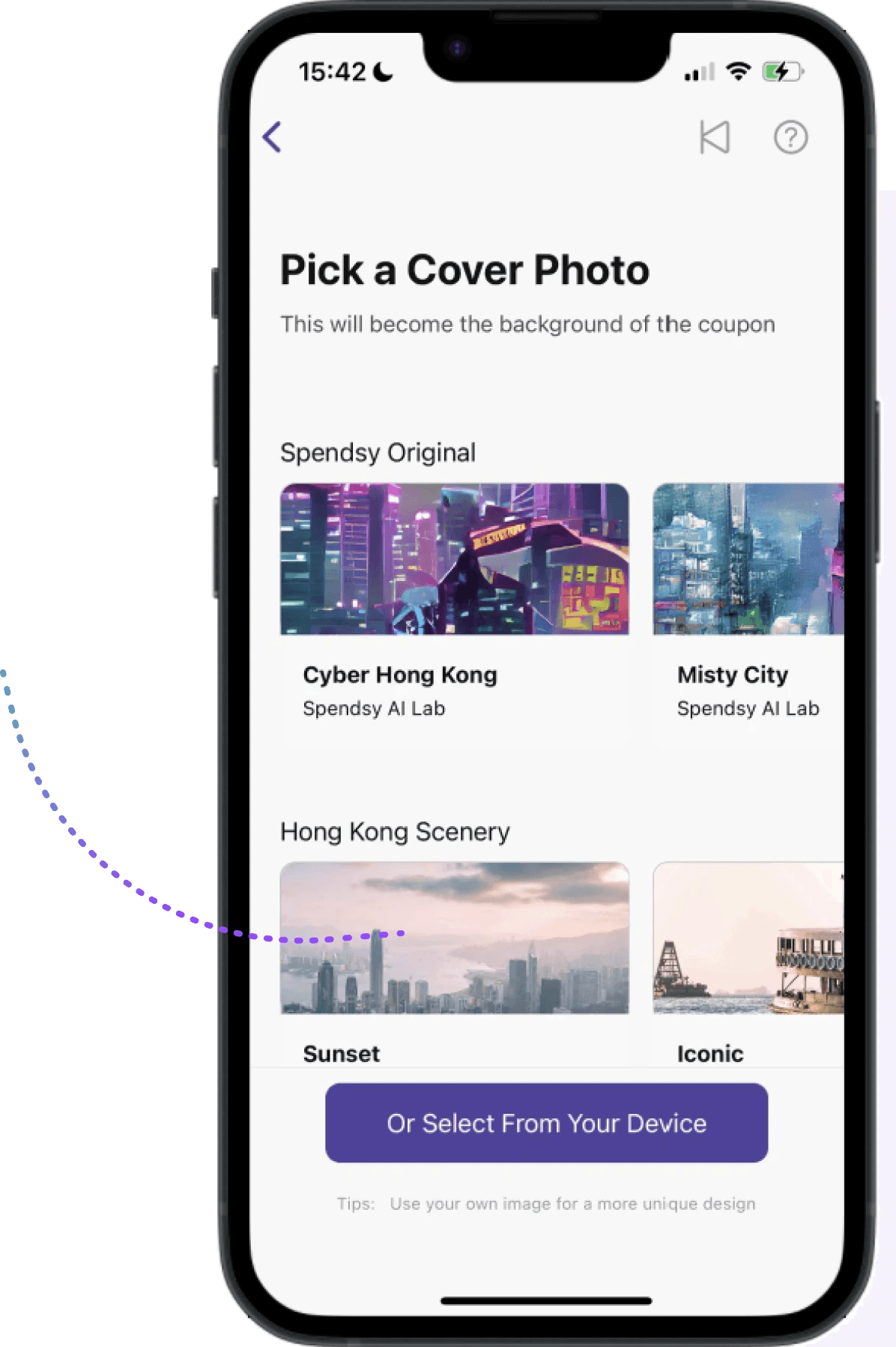
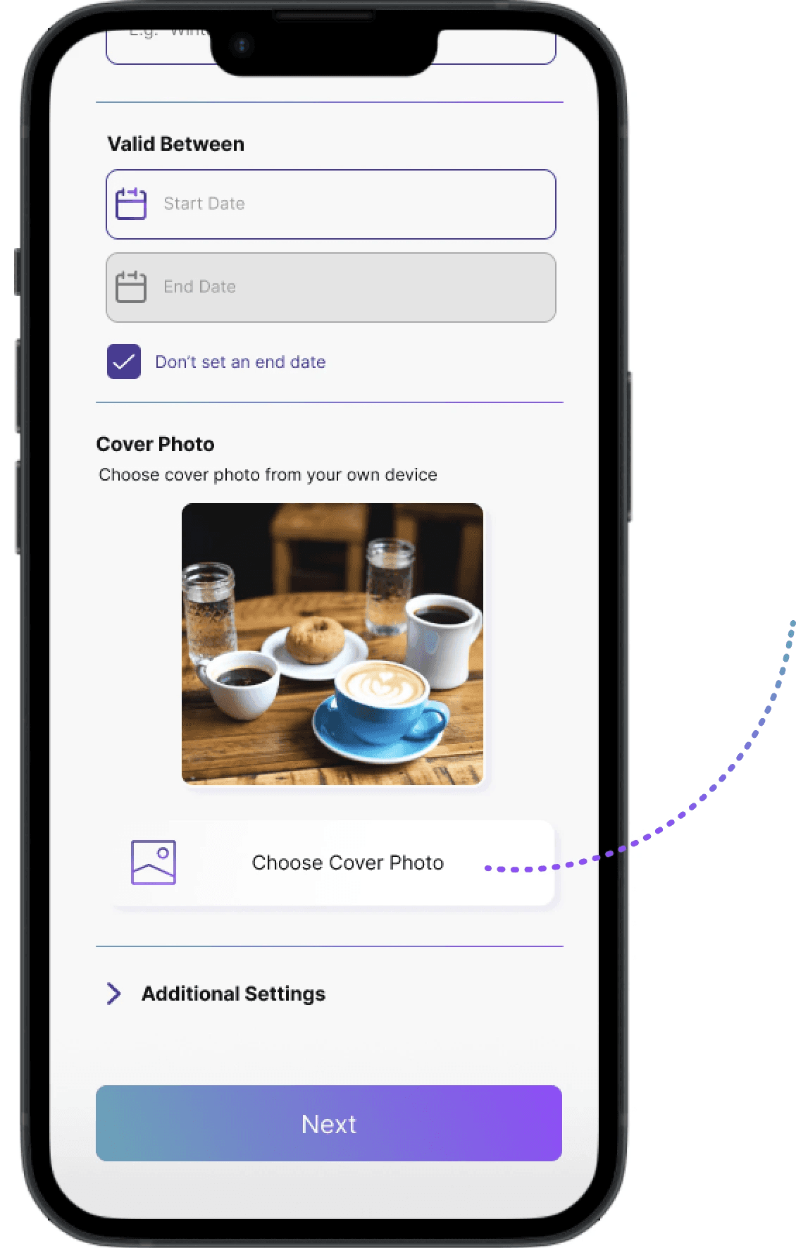
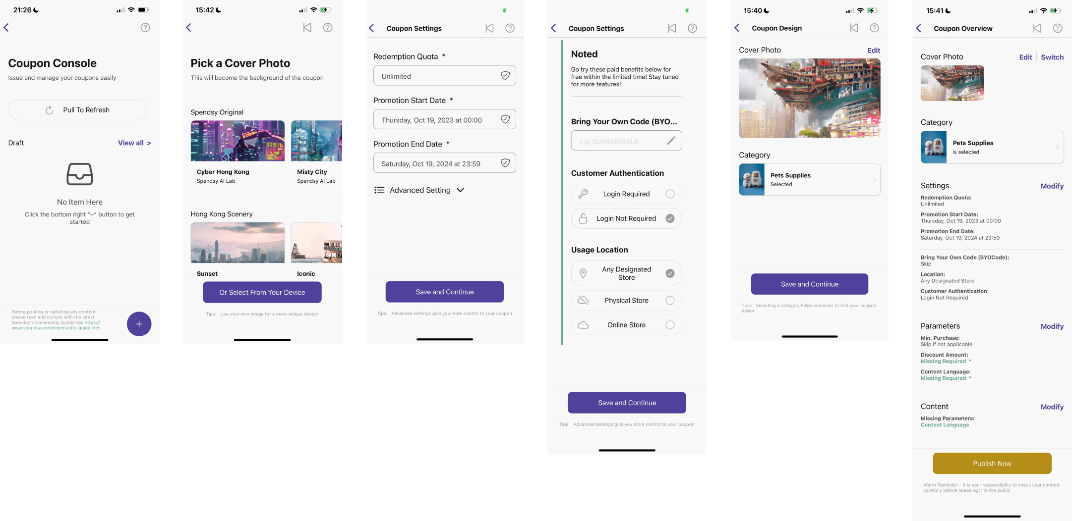
The goal from Spendsy was to encourage businesses to use their own images for the cover photo of the coupons instead of using the default ones that were provided. To do so, we decided to completely remove the option of allowing businesses to pick default images, which forcibly makes them use their own images

After

After

After

After

Before

Before

Before

Before

There were many default options, so it led to default bias where businesses just continued opted for the default options

Users can only pick photos from their own device

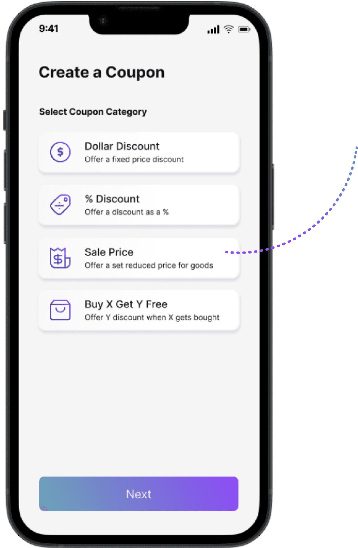
Clearer coupon categorization

Businesses will need to pick the categories at the start before inputting the further details. This allows for better categorization for coupons in the explore page as the step is emphasized in the process instead of leaving it to the end
After

Before

The importance of the categories were not emphasized in the old screens, so users might easily select the wrong thing

Clear icons and descriptions for the different category options
After

Before

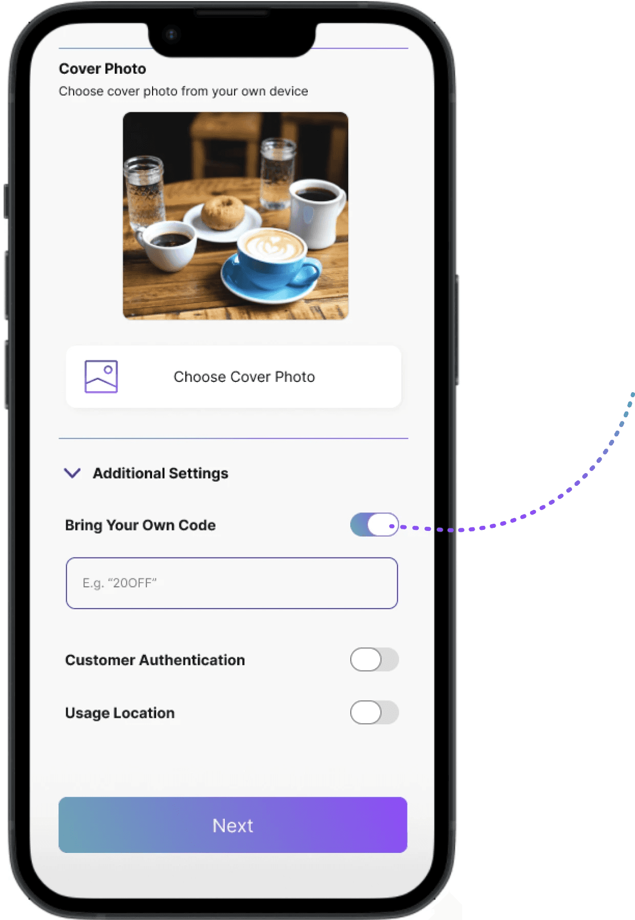
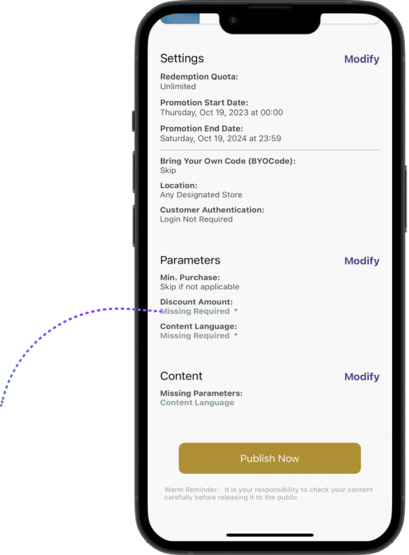
Users would not know there were many parameters and additional settings needed to adjust before the last step of publishing the coupon

Parameters are simplified and additional settings are hidden unless users need them

Hick's Law: scale back on parameters


The number of additional settings and parameters needed that were available for users were too overwhelming in the previous screen. Hence to improve that the new version had toggles to only show the different additional parameters when needed, so the screen will not be crammed by all the different information

a

Reflections

Lessons from real life projects


This design project was an extremely meaningful learning process as it was the first time to work with an actual business as well as getting feedback from real users. I got to work closely with the stakeholders and the other product designer in the team to tackle the problems with the app and figure out potential product strategies. It was also very rewarding to see real analytics of increased engagement from users using the app


Next steps to develop


After this design revamp, I will work closely with the developers and co-founders to discuss the image ratio that will be used across the platform, to ensure it will be consistent with other products and future features that are planned out. Spendsy also has plans to streamline more of their current user flows to make them more intuitive for users when Spendsy 2.0 rolls out, so continuously gathering user feedback will be needed to maintain balance between user satisfaction and business goals
Thank you for making it to the end!

Back to projects