01
Context
The Context:
Substance is a fictional subscription management desktop web app that is targeted for adults that are newly financially independent. There's a current market gap for subscription management websites that are targeted towards young adults in their mid twenties that are recently financially independent and lack the financial management
The Challenge:
Encouraging financially independent adult users to use services to manage subscription expenses
Introducing Substance
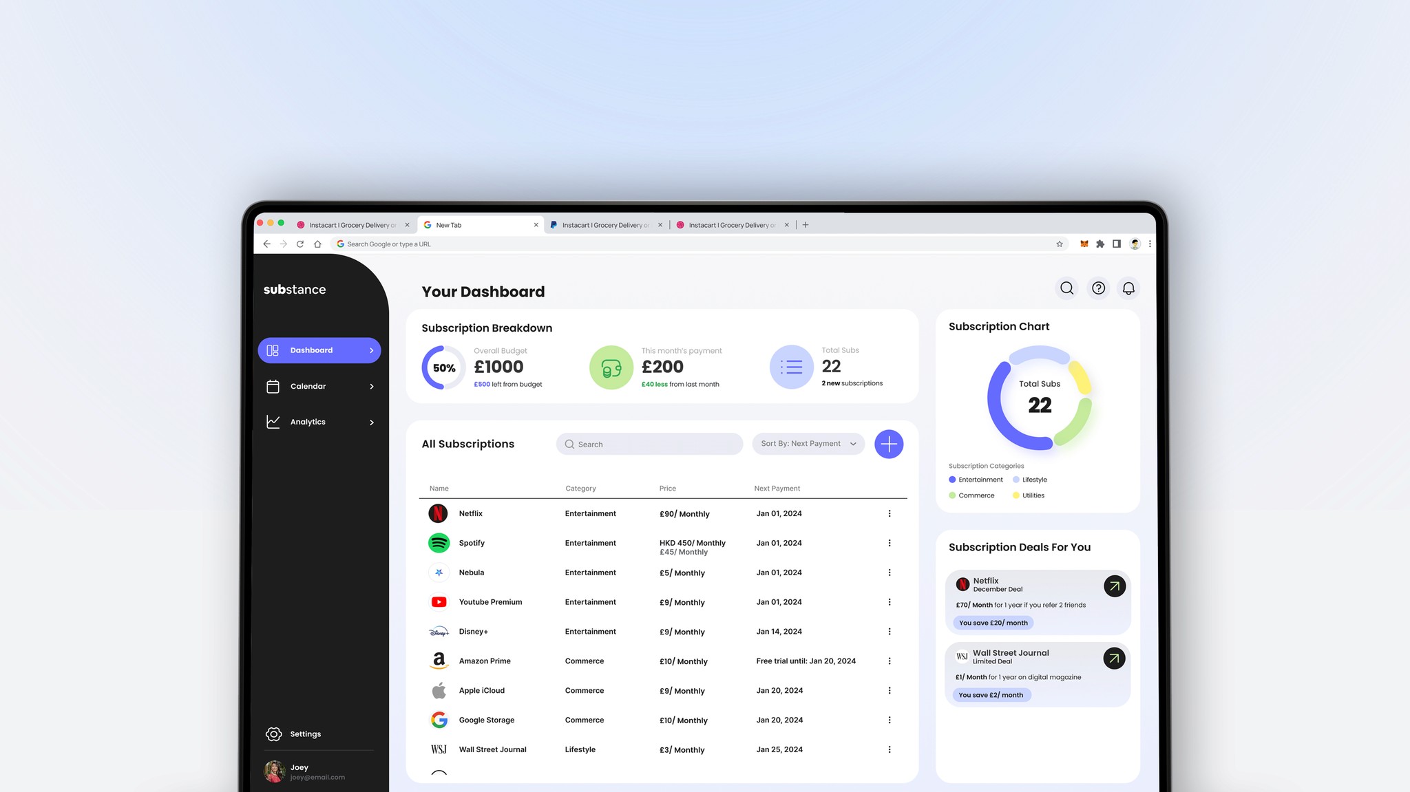
Substance is a desktop web app that lets users have an overview of their subscription expenses. It also provides users control over their budgeting and offers suggestions for better prices

02
Research
The Process: Understanding the users
Why subscriptions?
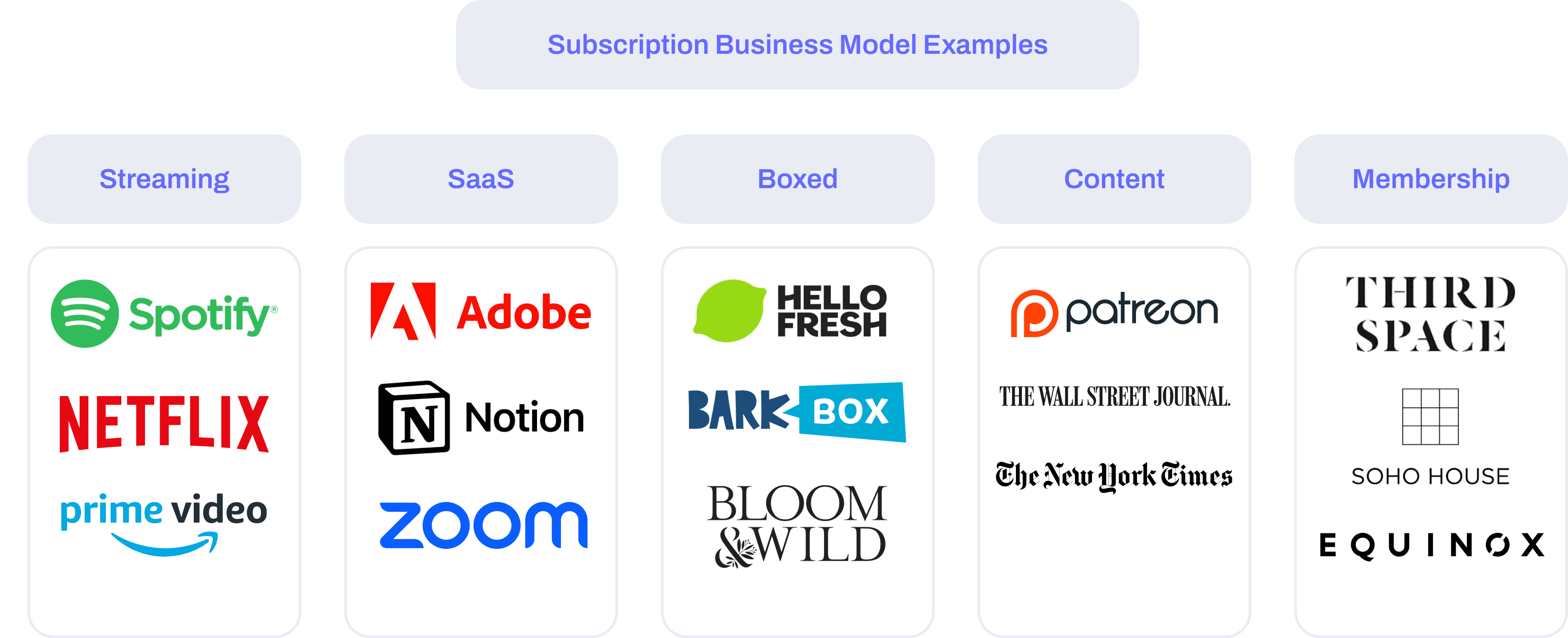
The issue that we face currently is the trend of subscriptions are slowly increasing post-Covid as businesses would adopt a subscription based payment rather than one-off payments. As these subscription payments start to accumulate, people tend to start losing track of the payments they have. People in their mid-twenties becoming financially independent might not realize the amount of subscription payments they need to pay for regularly
1/ Interviews
I began my research with user interviews, which allowed us to get some insight of adults in their 20s on their spending habits and subscription management in relation to their income and lifestyle habits. 6 participants were involved in the interviews where all have some sort of income from jobs
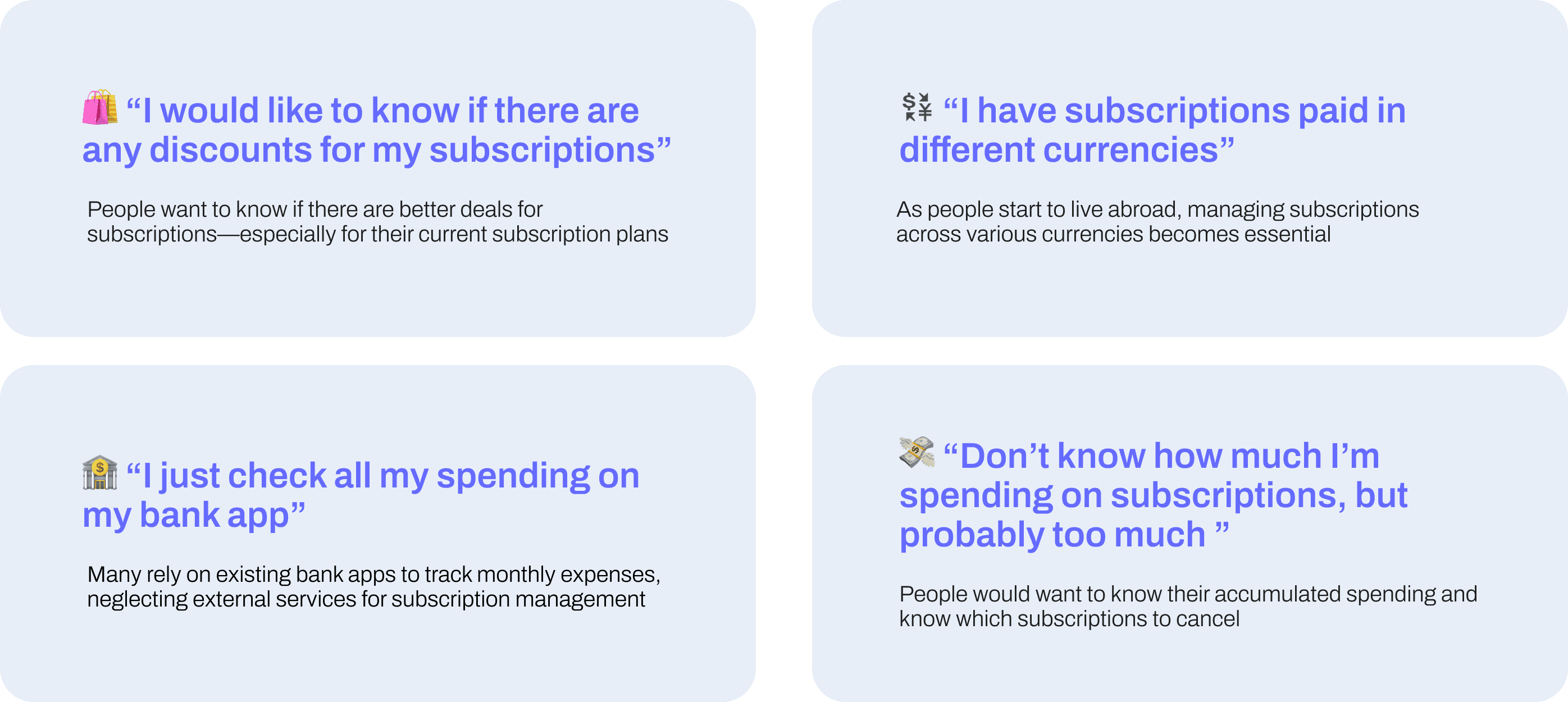
Key Insights:
2/ Themes
An affinity mapping was done based on the interview insights to see if there were any recurring themes or pain points that were raised by the interviewees. To my surprise, even though all interviewees had different spending habits, all of the six interviewees thought that they spend more than they should on subscriptions

3/ Persona
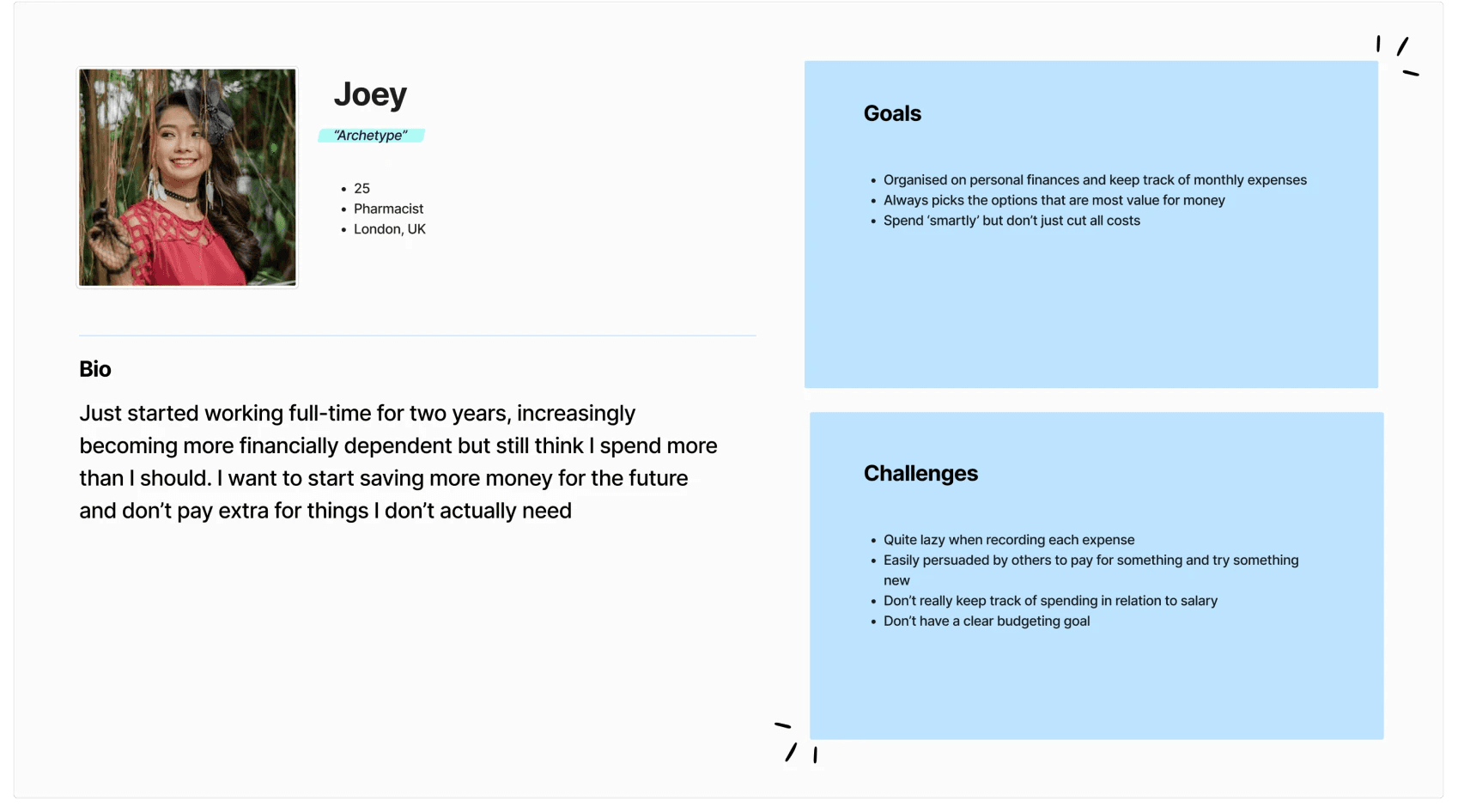
Meet Joey, a persona was introduced as a combination of the interview insights and a potential of what a user in their mid 20s would be like if they were to use the subscription management tool
Competitive Analysis
In order to have more ideas on how to design a subscription management website, I searched what current competitor websites are like. This analysis will let me identify what basic features are needed in every subscription management website, what services they offer that are different, and how can I build up on that
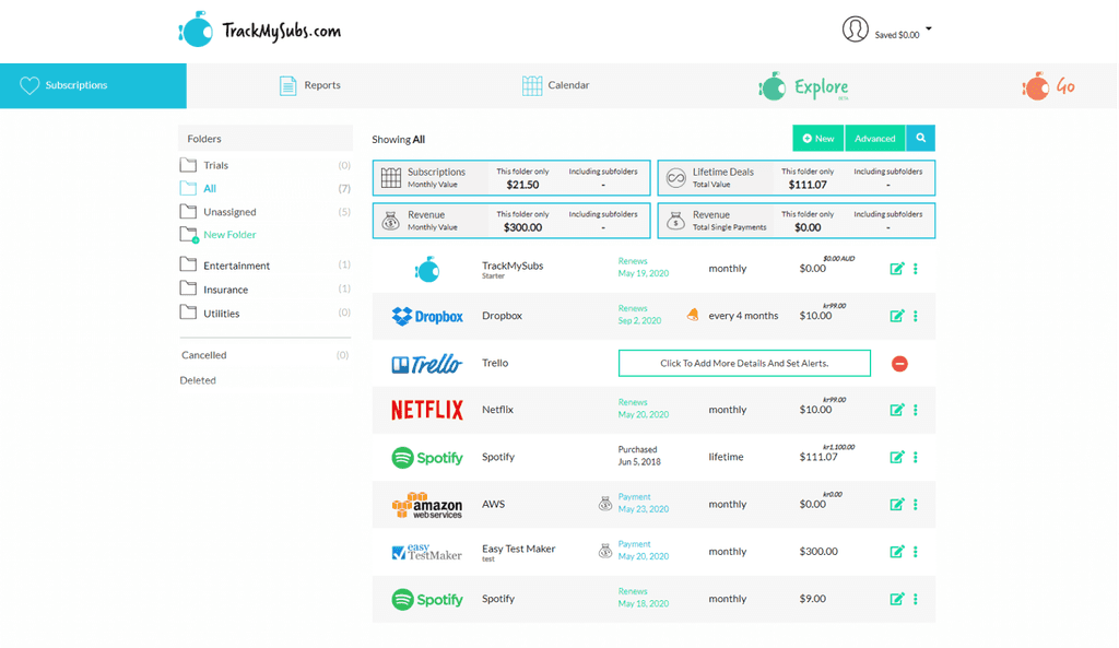
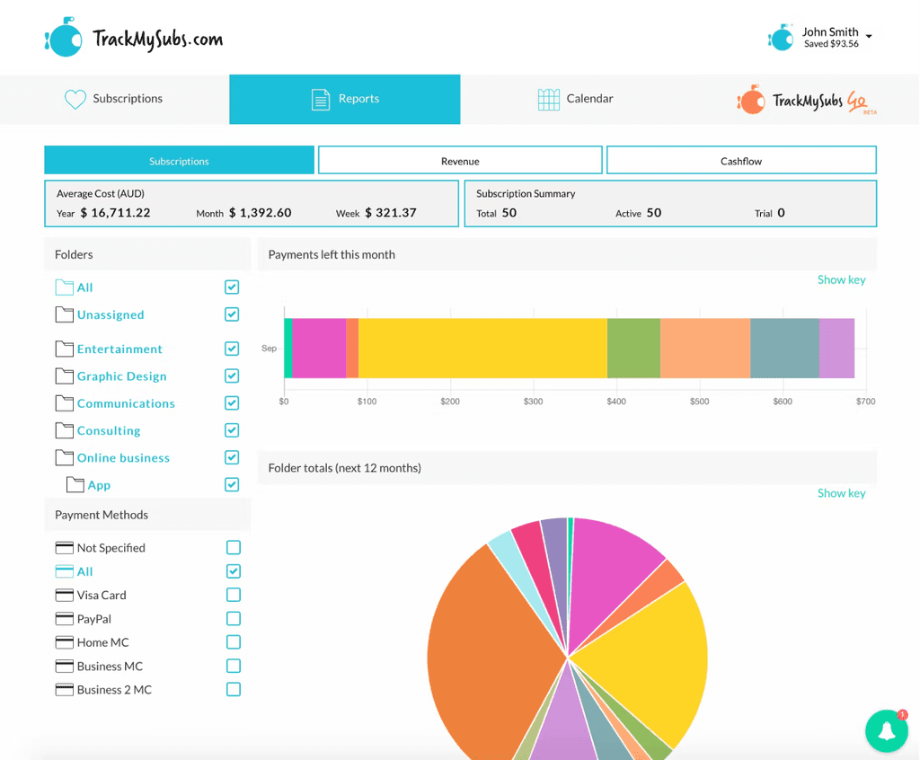
Track My Subs
Pros:
Logos of subscriptions are included which allows the user to easily identify the different companies/subscriptions
Simple layout to allow easy navigation and splits different categories of subscriptions into sub-folders
Different font colours to identify which subscriptions require payment or will auto-renew
Cons:
Layout looks like an excel spreadsheet. Very informative but not visually appealing for new users of users that are seeking for new features
Shows total amount of value for money, but doesn’t show any data within the same page
No consistent colour theme for different categories throughout the screens
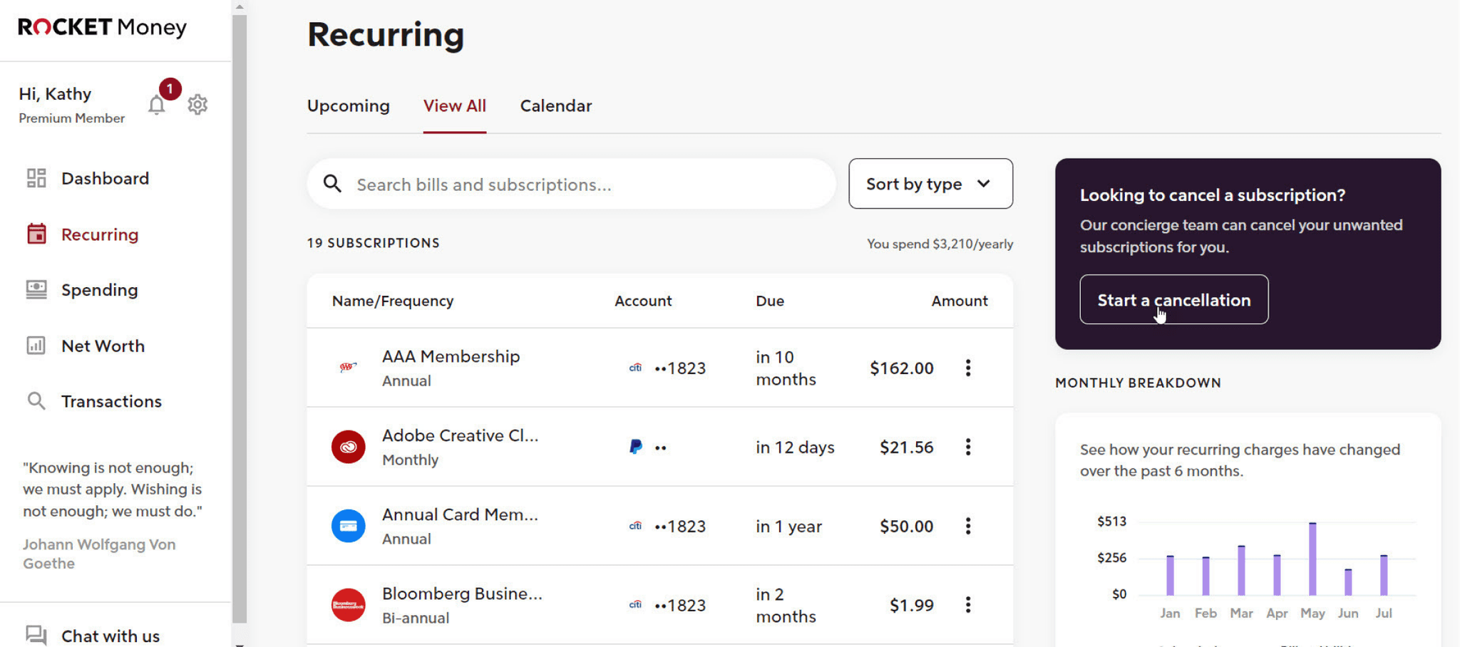
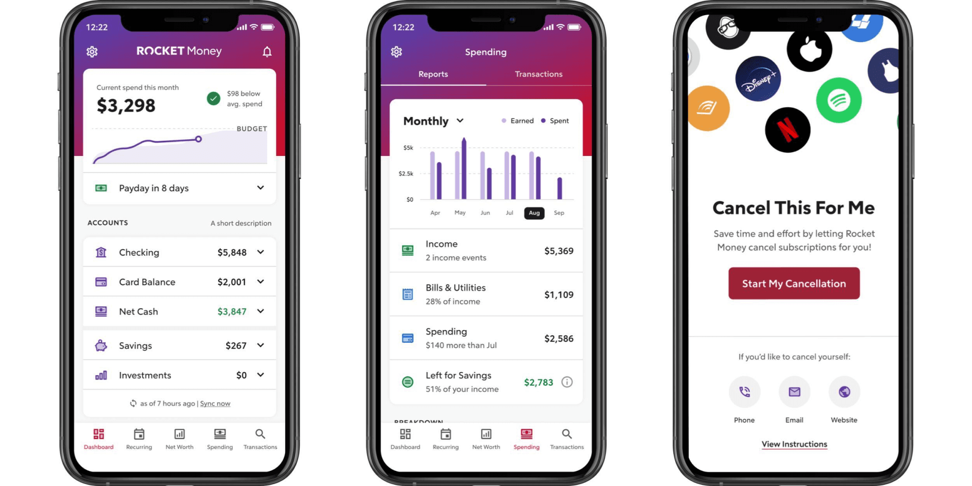
Rocket Money
Pros:
Clean layout for different information on the screen
Provides both mobile and desktop options for user to track their subscriptions anytime on any platform
Cons:
Doesn’t have any hierarchy to which payments have larger amounts or unusual payments if the user wants to budget
Works like a banking app but doesnt provide any new features of new users
03
Ideation
Mapping Out User Flows
Two user flows were created based on the key user needs. The first user flow dictates the primary flow in which the user would add and manage subscriptions on the page. It assumes most actions could be done through the home page, with exception of viewing data analytics of the user’s spendings.
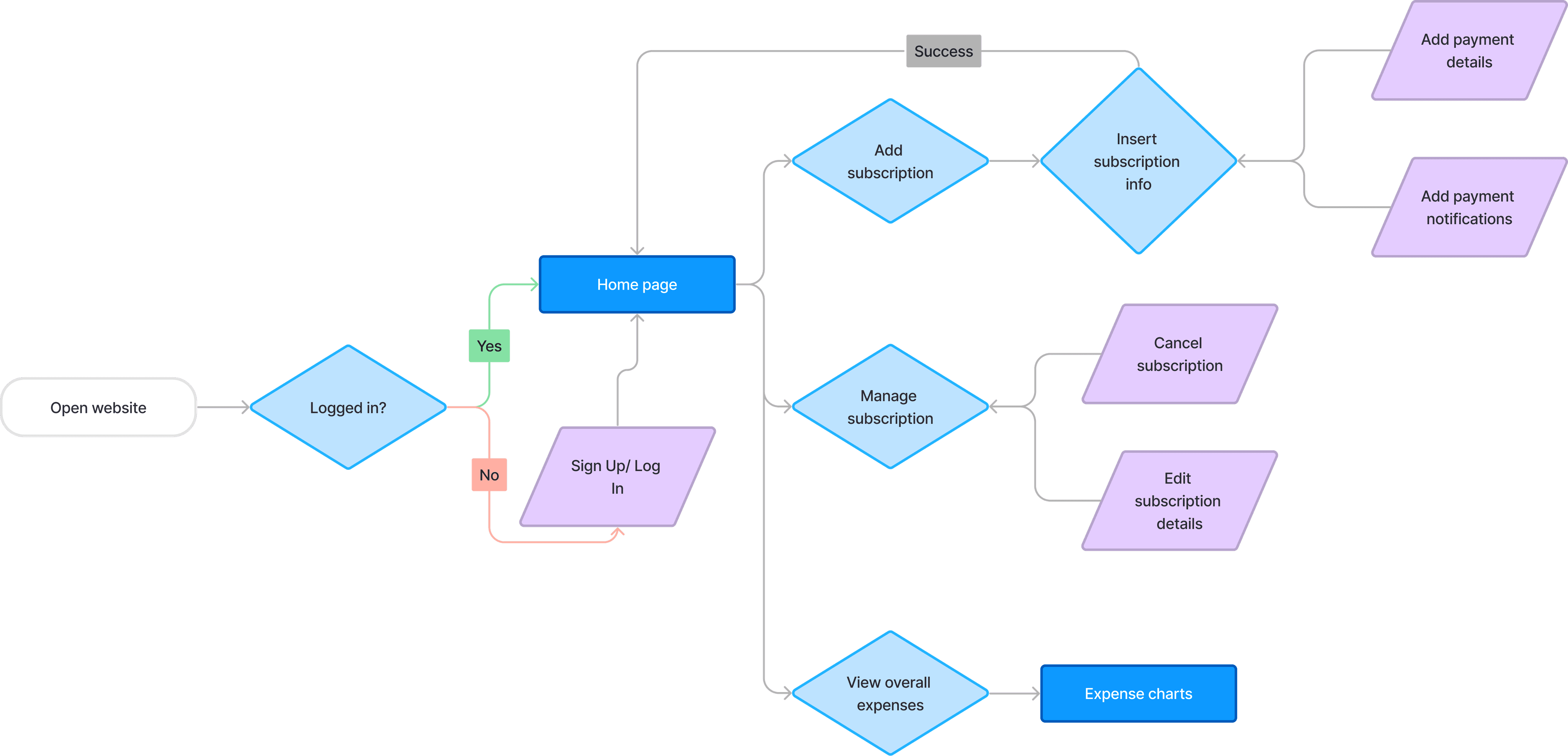
The second user flow dictates the user adding a free trial to a subscription, and having the option to add a notification to let the user know when the free trial is nearly over and cancel it in time before it starts charging the user

Quick sketches were created to explore potential layouts for the main dashboard and determine the essential features to include. This also illustrates the information hierarchy to clarify which elements are prioritized

Based on the hypothesis of what design features are needed, low fidelity wireframes were created to have a basic idea of what the final design may look like. It is also to test out user's interest in the website and what improvements they think are needed
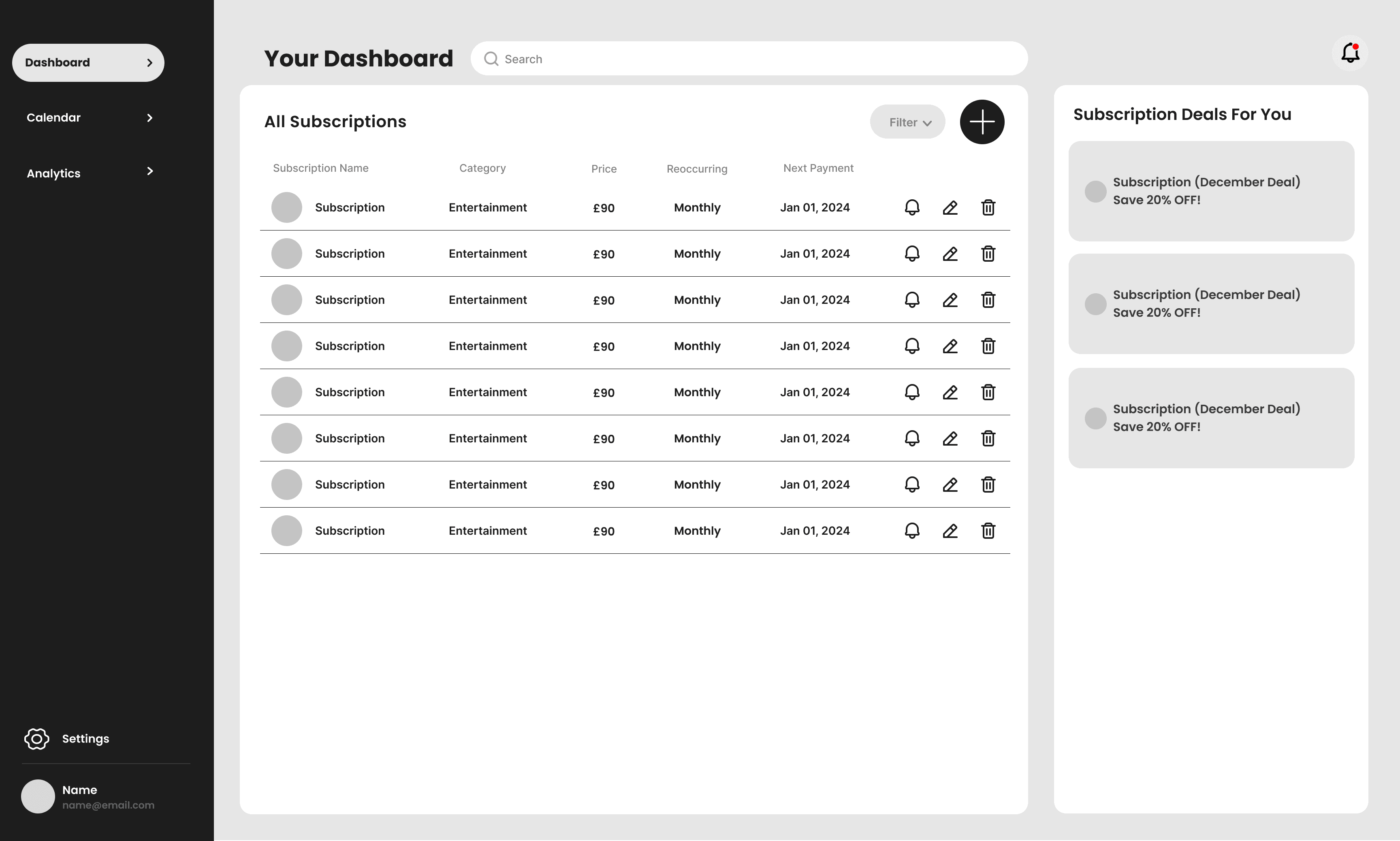
Dashboard Layout
Feedback + Design Iterations
Design iterations were made on the high-fidelity designs based on the feedback given by users during the user testing
Subscription window too cramped
❌ To Work On:
Users expressed that the edit subscription window was too cramped, and there were too many buttons within close proximity of each other
✅ Solution:
Layout became more spaced out, with only one edit button at the top corner to edit the rest if needed. Giving the overall layout a cleaner look
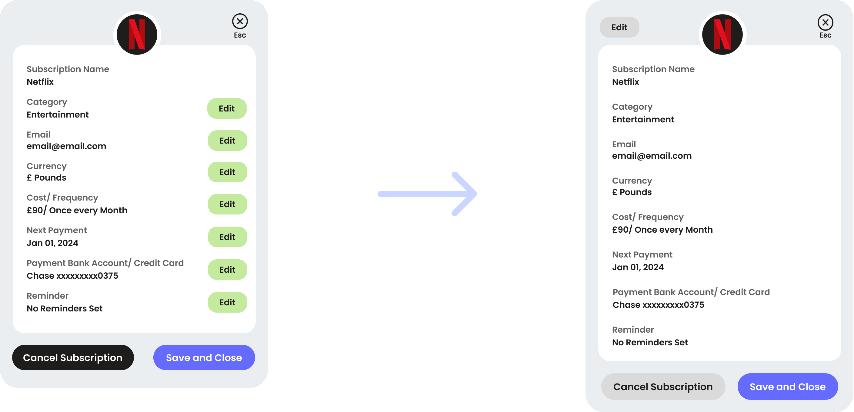
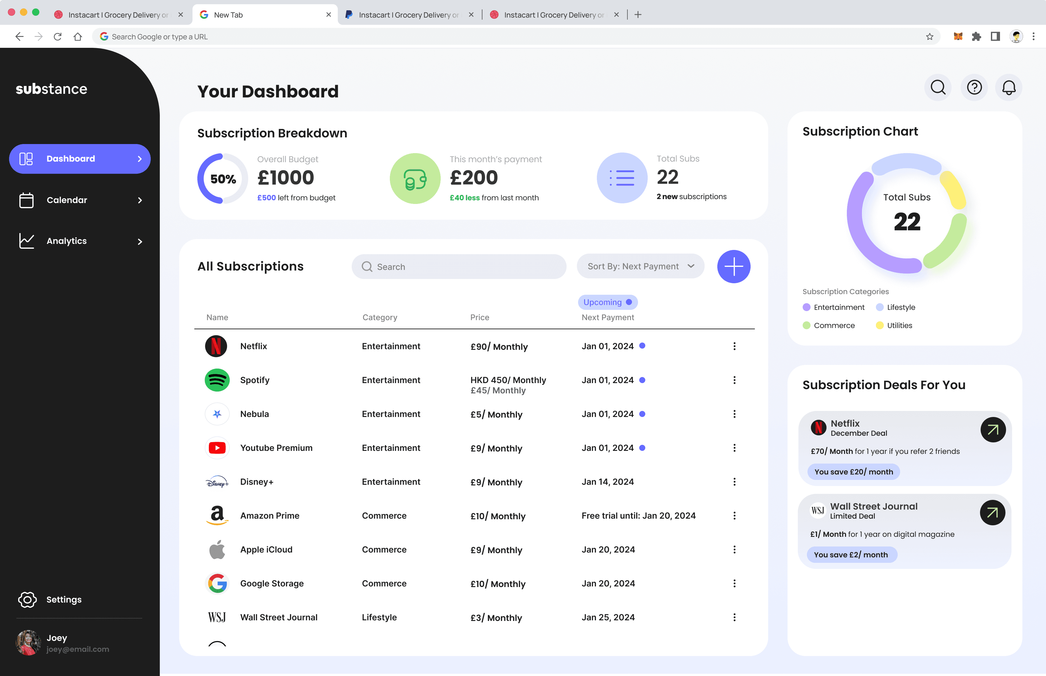
Dashboard layout unbalanced
❌ To Work On:
Some users thought that the dashboard layout was unbalanced, with the subscription list crowded while the subscription deals box was empty
✅ Solution:
Added more to the overall layout so users could see an overview of their subscription chart and breakdown in the dashboard

04
Final Design
I wanted the overall style of Substance to feel approachable, professional, and clean so the overall color scheme followed a cool toned yet bright color choices to suit the target audience

Style Guide
Final Designs
1/ Cancel subscriptions easily
Users can cancel their subscriptions easily by editing their subscription. They would also be notified how much is saved when they cancel the subscription

2/ Clear overview of all subscriptions
Calendar view is available to allow users to have a better view of their monthly subscriptions. They can also view the subscriptions that are due on the same day
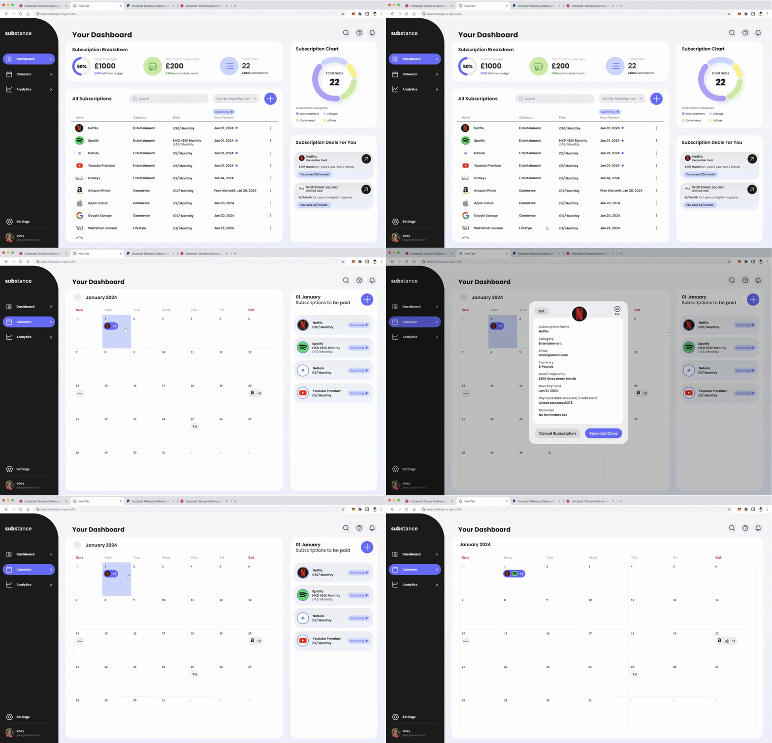
Figma Prototype
Click here to access the Figma prototype, or interact with the prototype below
05
Reflections
Reflections
Learnings
Being used to designing phone app designs makes desktop web app a different challenge. I enjoyed challenging myself in designing a field that I was unfamiliar with an researching the different aspects of it. I think being unfamiliar with the background made it easier to design features that were not seen before, and bring in new insights.
Next Steps
Since this was a time constraint project as well, I think if I had more time I would definitely want to explore more features and provide and more comprehensive analysis of lifestyle habits in relation to spending. My initial research pool was also quite small, the insights were given by my friends that fit the target audience, but I would also like to hear more from a wider audience with different insights
